
The Lab
Website Redesign
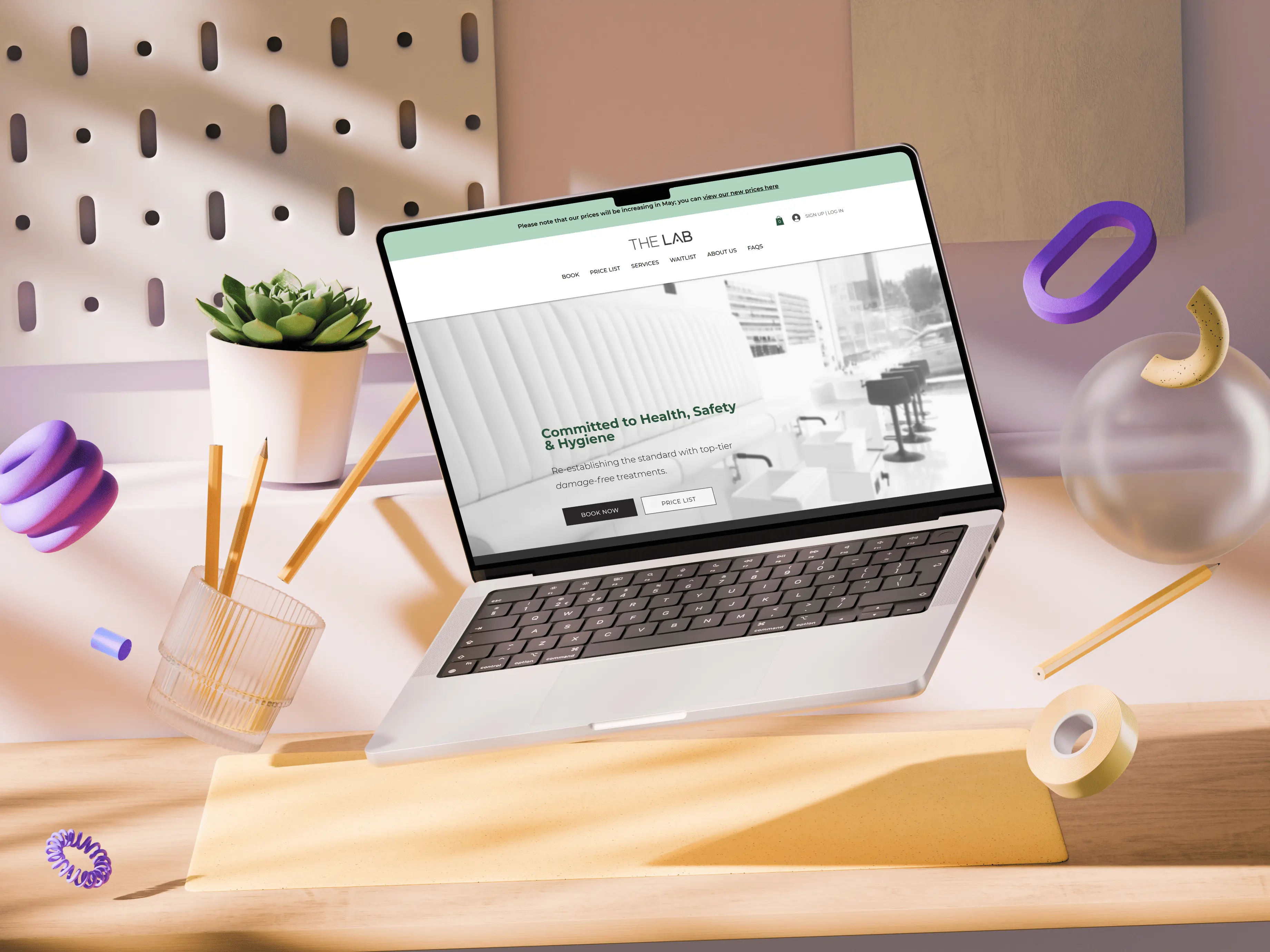
The Lab is a gel-free nail salon. I audited their existing Wix website and redesigned it to improve usability, clarity and overall user experience.
The Lab had an existing website built on Wix, but it lacked clarity and consistency. Key usability issues included low contrast text, small font sizes and buttons that appeared clickable but weren’t linked, which created confusion for users. The goal was to improve the overall experience, making the site easier to navigate and more aligned with the brand.
The Brief
I carried out a UX audit to identify usability and accessibility issues across the site. Using these insights, I created redesigned page layouts in Figma that improved structure, hierarchy and clarity. I then rebuilt the website in Wix, implementing the new designs and using repeaters and the Wix CMS to make content easier to manage and update.
My Approach
The new site is clearer, more consistent and easier to navigate, improving the overall user experience. The use of repeaters and CMS functionality means the site is now more maintainable, allowing the client to update content more easily as the business evolves.
The Outcome
.webp)
%201.webp)
%201.webp)
%201.webp)
%201.webp)
Project Gallery
Testimonial
Charlotte was great help when we updated our website. She was able to execute the vision while also advising us on how to maximise the functionality of the website - and this is ultimately the difference between a DIY job and that of a professional. You can also rely on transparency with quotes and time frames - this was important as I hadn’t a clue what to expect. Highly recommend!
