
HNoss Proofreads
One-Page Inclusive UX Audit
A UX audit for HNoss Proofreads focused on improving the usability, accessibility, and overall experience of a high-traffic gender-neutral name generator page.
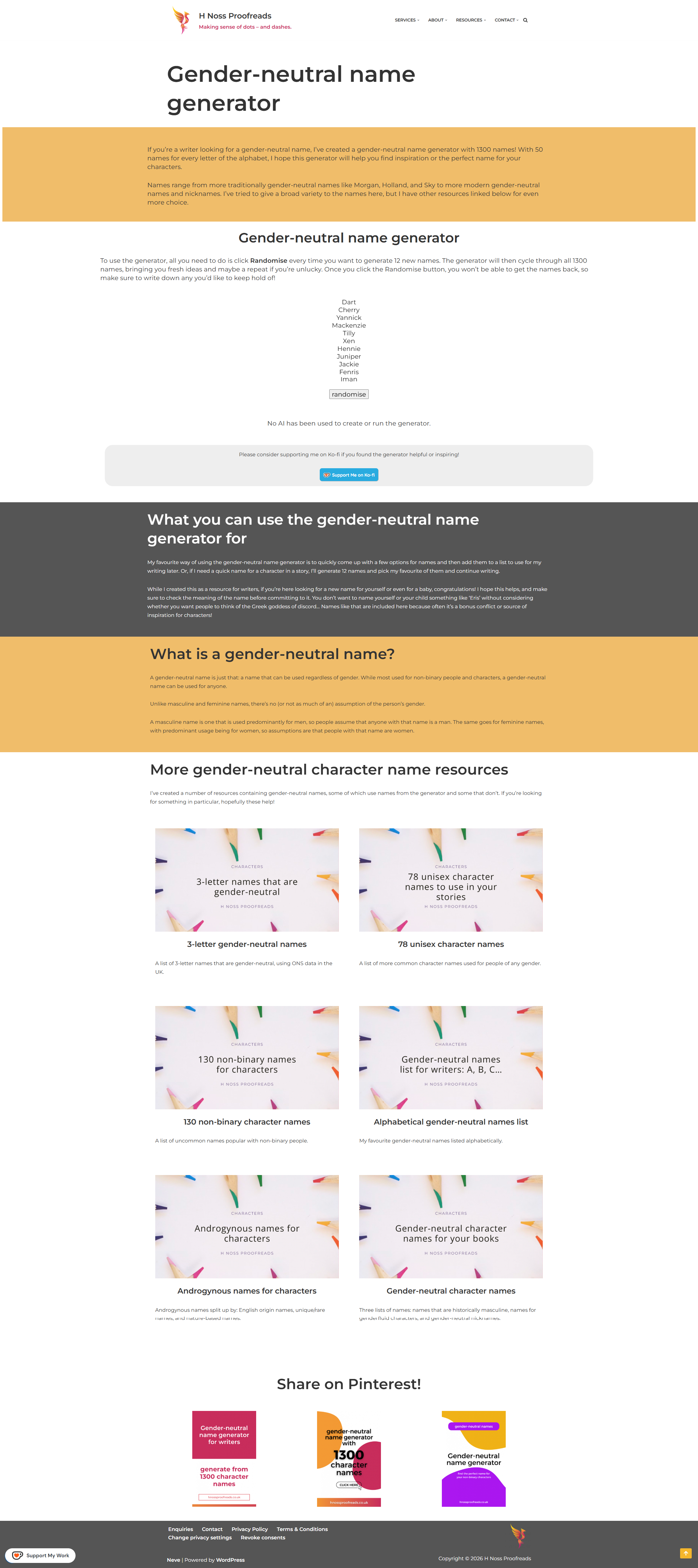
HNoss Proofreads wanted to improve the experience of their gender-neutral name generator page, which was already receiving a high volume of traffic through search engines and Pinterest. The goals of the project were to improve usability and accessibility, create a more neurodivergent-friendly experience, and encourage more meaningful engagement with their Ko-fi support page without disrupting the flow of the generator itself. The audit also needed to work within the existing WordPress setup and avoid a full redesign or rebuild of the page.
The Brief
Before starting the audit, I recommended implementing Microsoft Clarity so we could better understand how people were interacting with the page across both desktop and mobile. Using Clarity, I reviewed areas such as attention, scroll behaviour, and click patterns to identify where users were engaging well, where friction was occurring, and which areas of the page were being missed entirely. Alongside this, I conducted a full UX and accessibility audit of both the page structure and the generator itself. This included reviewing the heading structure, navigation, accessibility, and WCAG considerations, cognitive load, visual clarity, mobile usability, signposting to related content, and opportunities to better support Ko-fi engagement. A key part of the project was balancing usability improvements with the creator’s existing workflow and preferences. Communication was kept flexible and primarily text-based throughout the project to ensure the process felt comfortable, collaborative, and easy to manage. Rather than recommending a full rebuild, I focused on practical and achievable improvements that could have a meaningful impact without overcomplicating the experience.
My Approach
The audit provided a clear set of prioritised recommendations focused on improving usability, accessibility and engagement across the page. Several improvements have already been implemented, including updates to heading hierarchy, colour contrast, page structure and the placement of support content. The recommendations also helped create a stronger foundation for future improvements by identifying opportunities to reduce friction, improve accessibility and better support how people naturally interact with the page across desktop and mobile. Alongside the audit itself, introducing tools such as Microsoft Clarity encouraged a more data-informed approach to understanding user behaviour and ongoing optimisation.
The Outcome


Project Gallery
Testimonial
Charlotte was quick, efficient, and extremely knowledgeable from the moment I approached her for a UX audit of one of my high-traffic pages on my website. She worked flexibly with my preferences and made me feel at ease, comfortable, and confident from the outset. The delivered UX audit had so many fantastic points, many of which I had never considered, some of which I hadn't prioritised sooner, and she made it simple for me to action her findings. Every finding included the impact to user experience and a recommendation for the action, so I didn't feel stuck on how to fix any of it. It also didn't take me long to apply the fixes either, with some being quick wins and others being something I need to look into further.